
I love the vibrancy of water-based inks. This started from a Christmas gift a few years ago. Months went by with me contemplating the glorious colours in their beautiful clear glass bottles. At the time I was mainly painting acrylics on canvas. Ink on paper was a whole different ballgame, and I wasn’t sure where to start. I thought I needed to have control of a dip pen or more formal tools to use it. What I really loved doing was bouncing colour around to see the vibrations that hit me when I placed certain colours together.
Enter my friend, Glynis M Bryden, an artist who loves working in ink.
Glynis took a piece of watercolour paper, took a wide brush holding a lot of water, and wet the paper with one thick wavy line. She then dropped a tiny amount of black Indian ink onto the water, and I watched it spread. A few more drops here and there, and magic was happening before my eyes. And so my love of water based inks and paints began.
Glynis mainly works in black and white. I wanted to see what happened when I worked with colour.

At the time I didn’t expect to share the above photograph, so please excuse the missing edge. The deep blue wavy link immediately evoked the night sky for me. I liked the way the red and gold splashes work together too.
There are two ways I could have worked with this. Leave it like it is above and enjoy the colour against white. This sparseness appeals to me now. At the time, I wanted to test the other ink colours. This is how the three images ended up.

In the finished images, you can see how I used different brush sizes, put extra water in places to make the colour more transparent, used overpainting with silver to draw some elements together and also to paint over some of the messy blending points. My current feeling is that sometimes there CAN be too much colour. The night sky on blue gets lost among the gold, red and purple.
I see reflections of the work Glynis does as well. She has been a wonderful teacher and friend. Her work often shows layers of landscapes, moving both underground and into the universe.
Abstraction and Colour
Some of my early experiments were about pure colours. Essentially, I was bouncing colour around because I enjoyed the resonance of one colour next to another. There’s no plan to these paintings. They are pure colour in water on different types of paper. Along with watercolour papers, I used rice paper, yupo paper and khadi paper. I really enjoyed using the inks on the rice paper because the colour was so vivid. Be aware, if you want to try this, the ink goes straight through the paper and leaves an indelible impression on your drawing support.
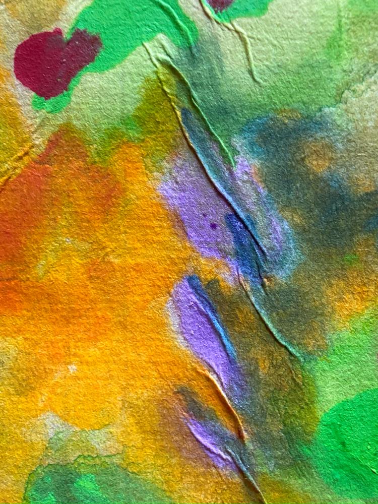
One painting I did on rice paper is not interesting when you look at it as a whole. However, because the thin rice paper is inclined to pucker when wet, it creates raised areas. I found zooming into the details very inspiring. When I took photographs of various details and cropped them into individual images, they spoke to me. One resembles a delta flowing into a bay, and another resembles lavender flowers. I still use both of these as screen savers on my device. As I gaze at the colours, images that were never there emerge. It’s still magic.


What I Notice
Freedom. Pure freedom and the joy of just playing. Art doesn’t have to be serious. Play is so important and can help us find direction. For me, this encouraged me to do more with abstract art. Also, with patterns incorporating flow techniques.
If you enjoyed this post, check out more in the series on my website here on my 100 Days of Art page.
You can also find work by Glynis M Bryden on Facebook, or on her ZenArtAustralia website.
Leave a Reply